WOOstroid
Customizer
Customizer is a WYSIWYG theme settings interface. You can setup typography, navigation, widgets positioning, background images and colors settings here. Our theme installation will provide you with a wider range of settings, such as social networks configuration, page layouts setting, sidebars, block setting and much more. The main advantage is that you can see the result immediately, and you can change it in no time flat without having to work with the files or code.
Site Identity
Here you can setup site identity.
Preloader Upload
Upload Preloader image
Site Title
Your website title goes here.
Tagline
This a short statement similar to a subtitle or advertising slogan.
Show Tagline After Logo
This property specifies whether to show or hide tagline after logo.
Show toTop Button
This property specifies whether to enable or disable topTop button.
Show Page Preloader
This property specifies whether to show placeholder or not.
Logo & Favicon
You can configure logo and favicon here
Logo Type
-
- Image
- You can choose a logo image from the media library in the next option
-
- Text
- Your WordPress Site Title will be shown instead
Logo Upload
Click the "Choose Media" button to select the logo image from the media library or upload your image.
Invert Logo Upload
Upload invert logo. Displays only at style 1 header layout.
Retina Logo Upload
Here you can upload the logo for retina-ready devices
Invert Retina Logo Upload
Upload invert logo for retina-ready devices. Displays only at style 1 header layout.
Site Icon
Icon image that is displayed in the browser address bar and browser tab heading. Icons must be square. Max icon (.ico) size is 32x32 px. You can also upload favicon for retina displays. Max retina icon size: 512x512 px. Also you can Enable Retina optimization and Show preloader when open a page via selecting the checkbox.
Breadcrumbs
Here you can set up site breadcrumbs.
-
- Enable Breadcrumbs
- Show / Hide breadcrumbs
-
- Enable page title in breadcrumbs area
- Show page title in breadcrumbs area
-
- Enable Breadcrumbs on front page
- Enable/disable breadcrumbs on front page
Show full/minified breadcrumbs path
-
- Full
- Full breadcrumbs display mode
-
- Minified
- Minified breadcrumbs display mode
Social links
Here you can set up site social links.
-
- Show social links in header
- Displays the list of links to social networks pages in site header
-
- Show social links in footer
- Displays the list of links to social networks pages in site footer
-
- Add social sharing to blog posts
- Displays "share in social networks" buttons in blog posts
-
- Add social sharing to single blog post
- Displays "share in social networks" buttons on a single blog post
Page layout
Here you can select the layout pattern for the main website container.
Header type
-
- Boxed
- Boxed layout will have fixed width and left/right indents
-
- Full Width
- Wide layout will fit window width
Content type
-
- Boxed
- Boxed layout will have fixed width and left/right indents
-
- Full Width
- Wide layout will fit window width
Footer type
-
- Boxed
- Boxed layout will have fixed width and left/right indents
-
- Full Width
- Wide layout will fit window width
Container width (px)
The width of main website container in pixels.
Sidebar width
The width ratio of the sidebar and main template container, can take two values: 1/3 or 1/4
Main box color
Here you can select the main box color.
Colors
Here you can set up the body background color of template.
Typography
Here you can configure headers and text typography
Typography
-
- Body text
- Main website text typography options
-
- H1 Heading
- H1 heading font settings
-
- H2 Heading
- H2 heading font settings
-
- H3 Heading
- H3 heading font settings
-
- H4 Heading
- H4 heading font settings
-
- H5 Heading
- H3 heading font settings
-
- H6 Heading
- H4 heading font settings
-
- Breadcrumbs
- Breadcrumbs font settings
-
- Entry meta
- Website text typography options
Font Family
This property specifies the font-family for an element
Font Style
This property specifies the font style for a text
Font Weight
This property sets the font weight of the text
Font Size, px
This property sets the font size
Line Height
This property specifies the line height
Letter Spacing, px
This property increases or decreases the space between characters in a text
Character Set
This property specifies the character set for an element
Text Align
This property specifies the horizontal text alignment inside the element
Header
You can set header items here
Header Styles
-
- Layout
- Here you can select site style layout
-
- Header Overlay
- Enable/disable header overlay
-
- Enable invert color scheme
- Enable/disable invert color scheme
-
- Background Color
- Here you can define site header background color
-
- Background Image
- Here you can define site header background image
-
- Background Repeat
- This property sets if a background image will be repeated, or not. By default, a background-image is repeated both vertically and horizontally
-
- Background Position
- This property sets the starting position of a background image. By default, a background-image is placed at the top-left corner
-
- Background Attachment
- This property sets whether a background image is fixed or scrolls with the rest of the page. By default, a background attachment is scroll
-
- Enable search
- Enable/disable search
-
- Enable top panel
- Enable/disable top panel
-
- Background color
- Here you can define header top panel background color
-
- Show header contact block
- Show/hide footer contact block
-
- Contact item 1
- Here you can set a contact icon and contact information
- Label – Contact name
- Description – Contact content
-
- Contact item 2
- Here you can set a contact icon and contact information
- Label – Contact name
- Description – Contact content
-
- Contact item 3
- Here you can set a contact icon and contact information
- Label – Contact name
- Description – Contact content
-
- Enable sticky menu
- Enable/disable fixed stick-to-top main menu
-
- Enable item description
- Enable/disable item description
-
- More menu button type
- Here you can select button type
-
- More menu button text
- Here you can type menu button text
Top Panel
You can set header top panel here.
Header Contact Block
Main Menu
You can configure main navigation menu here.
Background Image
Here you can set up the main background image of the body template.
Menus
Your theme supports 4 menu locations. Select which menu appears in each location. You can also place menus in widget areas with the Custom Menu widget.
Menus
Menu title
-
- Add items
- Select items and add them to Beuty meny, reorder them
-
- Delete menu
- Here you can delete the selected menu
-
- Display location
- Select menu location: Top, Main, Footer, Social
-
- Menu options
- Automatically add new top-level pages to this menu
Menu Locations
Your theme supports 4 menus. Select which menu appears in each location. You can also place menus in widget areas with the Custom Menu widget.
Locations list
-
- Top
- Select navigation menu, that will be displayed in site header
-
- Main
- Select main navigation menu
-
- Footer
- Select items for services-menu
-
- Social
- Select navigation menu, that will be used for social networks
Sidebar
Here you can configure the position of template sidebars.
Sidebar position
-
- No sidebars
- No sidebar will be displayed
-
- Sidebar on left side
- Sidebar will be displayed on the left side
-
- Sidebar on right side
- Sidebar will be displayed on the right side
MailChimp
Here you can setup MailChimp settings for subscribe widget
MailChimp API key
If you want to set up an integration with your MailChimp account, you'll need to generate an API key, and insert in this field.
MailChimp list ID
Each MailChimp list has a unique List ID that integrations, plugins, and widgets may require to connect and transfer subscriber data.
After the template installation you'll see the following message: "Please set up MailChimp API key and List ID" instead of the subscribe and follow form.
For more information, please visit official documentation
Widgets
You can configure widgets and their positions here. Main theme functionality is focused in widgets. Each template has a specific set of Widget Areas
Widget creating
In order to add a widget to template page you should first decide where will it be displayed on the website by selecting one of the Widgets Areas available. Next press the "+ Add a Widget" button on the list of widgets that appears. After doing this you can define the order of widgets appearance by pressing "Reorder" button.
Registered widgets areas
-
- Sidebar
-
- Single produst sidebar
-
- Header Fullwidth Area
-
- Before Content Area
-
- Before Loop Area
-
- After Loop Area
-
- After Content Area
-
- After Content Fullwidth Area
-
- Top Footer Area
-
- Bottom Footer Area
Footer
Settings for the website footer section
Footer Styles
-
- Logo upload
- Select your main footer logo to be an image. You must choose a logo image from the media library in the next option
-
- Copyright text
- Set custom copyright text for your Footer area
-
- Layout
- Here you can define the footer layout type
-
- Top Widget Area Columns
- Here you can define how many Top Widget Area Columns should be displayed
-
- Bottom Widget Area Columns
- Here you can define how many Bottom Widget Area Columns should be displayed
-
- Footer Background color
- Here you can define the Footer Area background color
-
- Footer Widgets Top Area Background color
- Here you can define the Footer Widget background color for footer top area
-
- Footer Widgets Bottom Area Background color
- Here you can define the Footer Widget background color for footer bottom area
-
- Footer Widgets Top Area Background Image
- Here you can define the Footer Widget background image for footer top area
-
- Footer Widgets Top Area Background Repeat
- Set background repeat for top area footer image
-
- Footer Widgets Top Area Background Position
- Set background position for top area footer image: center, left or right
-
- Footer Widgets Top Area Background Attachment
- Set background attachment for top area footer image: scrolling or fixed
-
- Footer Widgets Bottom Area Background Image
- Here you can define the Footer Widget background image for footer bottom area
-
- Footer Widgets Bottom Area Background Attachment
- Set background attachment for bottom area footer image: scrolling or fixed
-
- Show footer widgets area
- Show/hide footer widgets area
-
- Show Second footer widgets area
- Show/hide second footer widgets area
-
- Show footer logo
- Show/hide footer logo
-
- Show footer menu
- Show/hide footer menu
-
- Show Pay Systems in Footer
- Show/hide Pay Systems in footer area
-
- Image Pay System link
- Type in the image Pay System link
-
- Image Pay System upload
- Select the Pay System image
Footer Contact Block
-
- Show footer contact block
- Show/hide footer contact block
-
- Contact item 1
- Here you can set a contact icon and contact information
- Label – Contact name
- Value – Contact content
-
- Contact item 1
- Here you can set a contact icon and contact information
- Label – Contact name
- Value – Contact content
-
- Contact item 1
- Here you can set a contact icon and contact information
- Label – Contact name
- Value – Contact content
Ads Management
This option allows you to add various kinds of ads to the website. Just add a particular shortcode to any of the listed sections.
Blog Settings
You can set your blog settings here
-
- Layout
- Select the grid layout pattern for pages with custom blog layout
-
- Featured Post Label
- This setting specifies the featured Post Label
-
- Post content
- Select how you want to display the post content in blog listing
-
- Featured Image
- Set dimensions for post featured images
-
- Read More button text
- This setting specifies the "Read More" button label text
-
- Show post author
- Show / Hide post author
-
- Show publish date
- Show / Hide publish date
-
- Show categories
- Show / Hide categories
-
- Show tags
- Show / Hide tags
-
- Show comments
- Show / Hide tags
Woocommerce options
This section allows you to select a color of the bagdes' background on your site.
Woocommerce badge
-
- Onsale badge color
- Select Color
-
- Onsale badge bg
- Select Color
-
- Featured badge color
- Select Color
-
- Featured badge bg
- Select Color
-
- New badge color
- Select Color
-
- In stock badge color
- Select Color
-
- Out of stock badge color
- Select Color
-
- VC vendors badge color
- Select Color
-
- VC vendors badge background
- Select Color
Woocommerce page options
-
- Enable single product carousel on the thumbnails
- Enable/disable single product carousel on the thumbnails
-
- WooCommerce loop columns desktop
- Select the quantity of columns: 2 columns, 3 columns, 4 columns or 6 columns (4 with a sidebar)
-
- WooCommerce loop columns laptop
- Select the quantity of columns: 2 columns, 3 columns, 4 columns
-
- WooCommerce loop columns mobile
- Select the quantity of columns: 2 columns, 3 columns, 4 columns
Static Front Page
Your theme supports a static front page.
Front page displays
-
- Your latest post
- Front page shows a list of site posts that were recently added
-
- A static page
- This setting allows to choose site main and blog pages among the list of the available ones
-
- Front page
- Choose the front page
-
- Posts page
- Choose the posts page
404 Page
This section allows you to customize the 404 page to make it match with the corporate style of your business.
-
- Background Color
- Specify the background color
-
- Background Image
- Specify the background image
-
- Background Repeat
- Specify the background repeat
-
- Background Position
- Specify the background position
-
- Background Attachment
- Specify the background attachment
Additional CSS
This section allows you to add custom CSS and instantly see how your changes affect your site. The live prewiew allows you to work quickly without page refreshes slowing you down.
Export/Import
This section allows you to import or export customization settings for this theme.
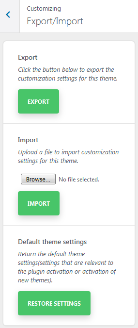
-
- Export
- Click the button to export the customization settings for the theme
-
- Import
- Upload a file to import customization settings for the theme
-
- Default theme settings
- Return to the default theme settings
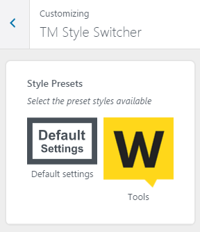
TM Style Switcher
This plugin is intended for export and import of customizer settings. TM Style Switcher simplifies working process with mass of theme settings, and affords theme basic settings transfer to other themes
Additional functions
The plugin allows to implement the so-called Skin Switcher or Style Switcher using the export files.
Every skin is presented in the form of a registered preset. The presets can be found in the tab of TM Style Switcher customizer. When tapping on a preset the settings from a json file, which were attached to the preset in the registration process, will be imported.