Voltager
Widgets
This section highlights the basics of working with the widgets (functional blocks). It explains where to start from, how to set them up correctly and use the full range of options.
About widget
This widget is used to display information about your site.
- Title - Widget’s text title
- Logo - You can select a logo for the widget
- Enable Social Buttons - Enable/disable social buttons
- Enable Tagline - Enable/disable tagline
- Content - Add content to this field
About Author widget
This widget is used to display information about selected user.
- Title - Widget’s text title
- Select user to show - You can choose a specific user
- Author avatar size - Choose the author avatar size
- Custom avatar image - Choose custom author avatar image
- Link text - Specify the read more button text
- Link - Specify the read more button link
Archives widget
This widget is used to display archives.
- Title - Widget’s text title
- Display as dropdown - Show archives as a dropdown menu
- Show post count - Show number of posts in archives
Banner widget
This widget is designed to add banners to the website.
- Widget Title - Enter the title of the widget
- Banner title - Enter the title of the banner
- Description - Specify the description of the banner image
- Source - Choose the source image for the banner
- Link - This option allows you to add a link to a particular banner. Hover on a thumbnail in the customizer and click the button in the middle of it to specify the address
- Open in - Specify whether to open the link in a current window or in a new one
Calendar widget
This widget is designed to display calendar
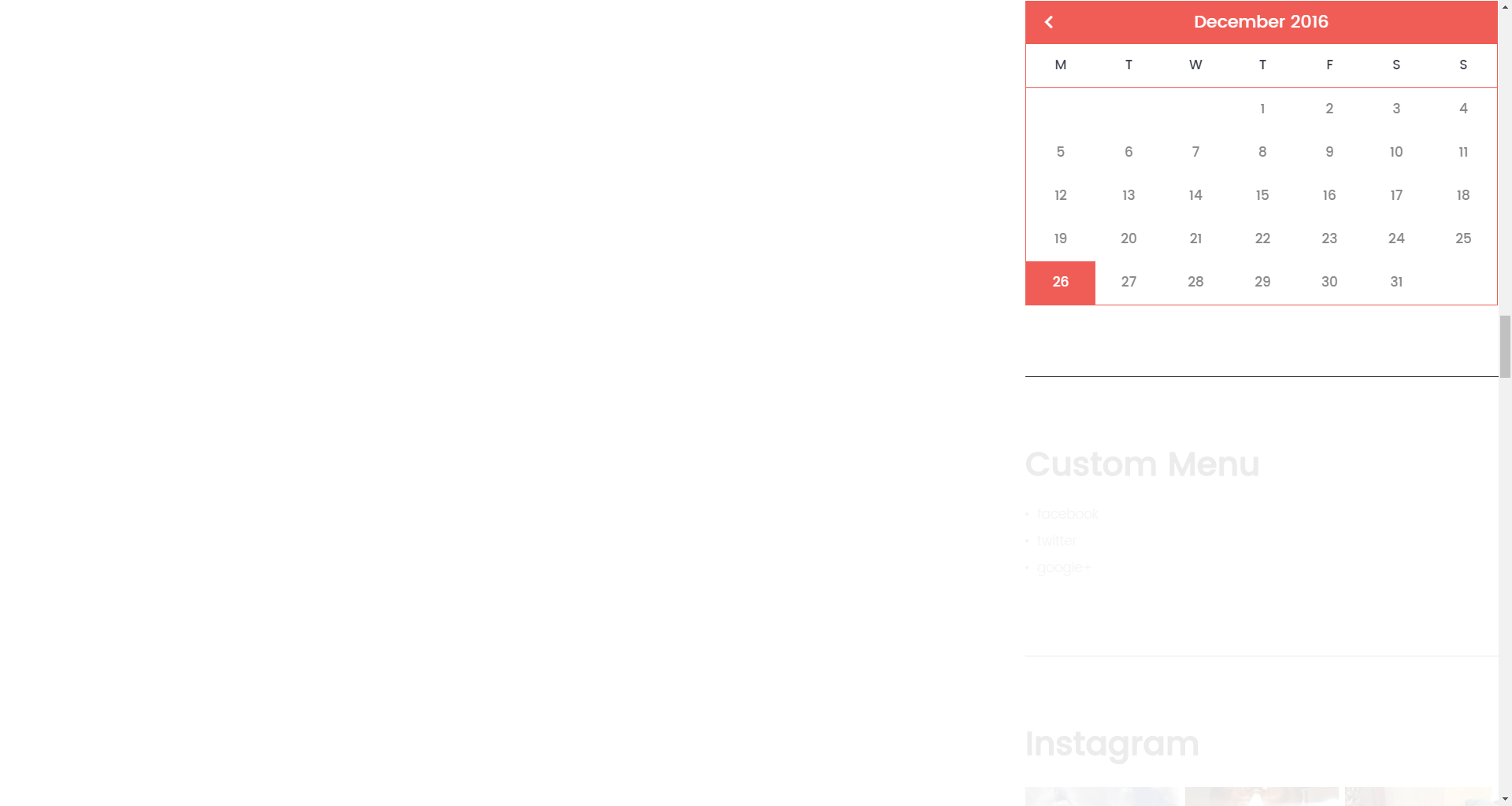
- Title - Enter the title of the widget
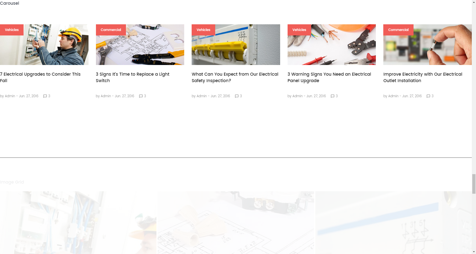
Carousel widget
This widget is used to display a list of your posts in a carousel layout.
- Title - Widget’s text title
- Choose taxonomy type - Choose posts source type
- Select category / Select tag - Choose tags or categories as your posts source
- Posts count - Limit the posts
- Display title - Choose whether to display post title
- Display content - Choose whether to display post content
- Display more button - Choose whether to display a more button
- Content words trimmed count - Limit the post content
- Number of slides per view - Choose a number of slides per view
- Number of slides per group - Choose a number of slides per group
- Multirow Slides Layout - Choose a number of rows
- Width of the space between slides (px) - Choose a distance between slides
- Duration of transition between slides (ms) - Choose the slides animation speed
- Slider navigation - Toggle the slider navigation
- Slider pagination - Toggle the slider pagination
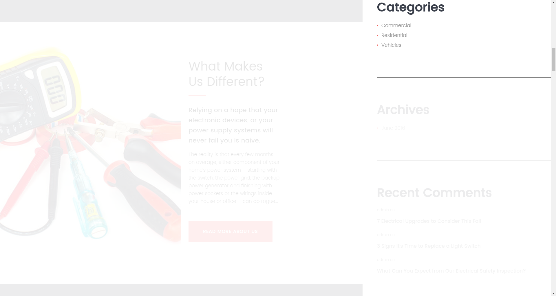
Categories widget
This widget is used to setup and display categories.
- Title - Enter the title of the widget
- Display as dropdown - This option allows to display the categories as a dropdown list
- Show post counts - Show/Hide post counts
- Show hierarchy - Show hierarchy
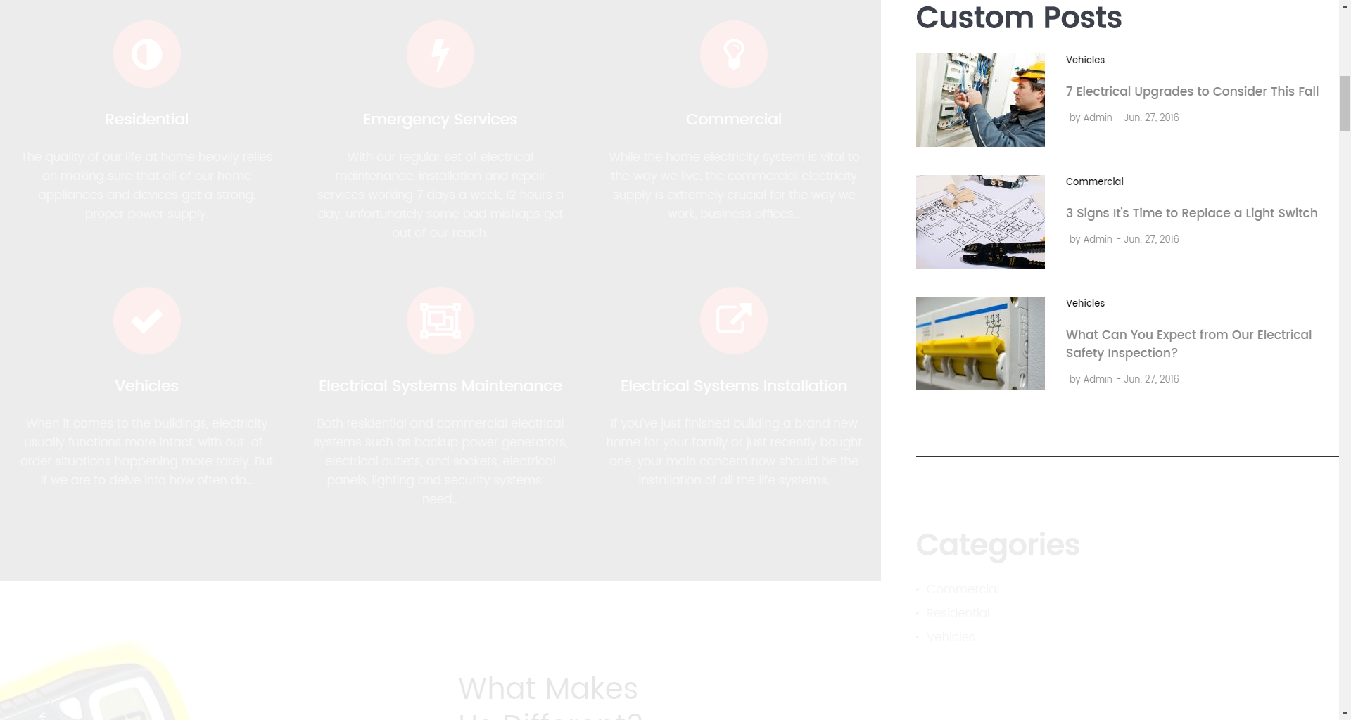
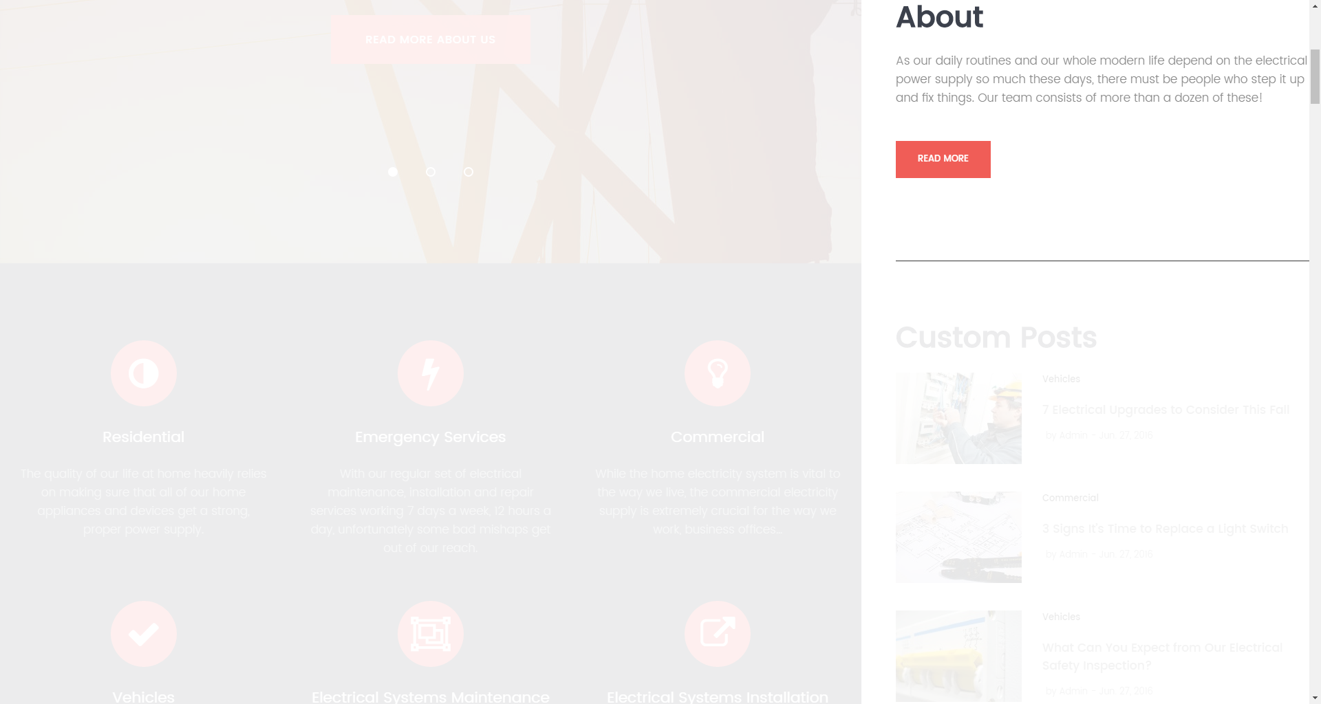
Custom Posts widget
This widget is used to display information about your site.
- Title - Widget’s text title
- Choose taxonomy type - Choose the posts source type
- Select cateogory / tag / post format - Choose the posts source
- Posts Count - Limit the posts
- Offset Post - Specify the offset
- Title words length - Specify post title length
- Excerpt words length - Specify post content length
- Display post meta data - Choose which meta data should be displayed to the user
- Post read more button label - Specify a read more button label
Image Grid widget
This widget is used to display a list of images from your posts.
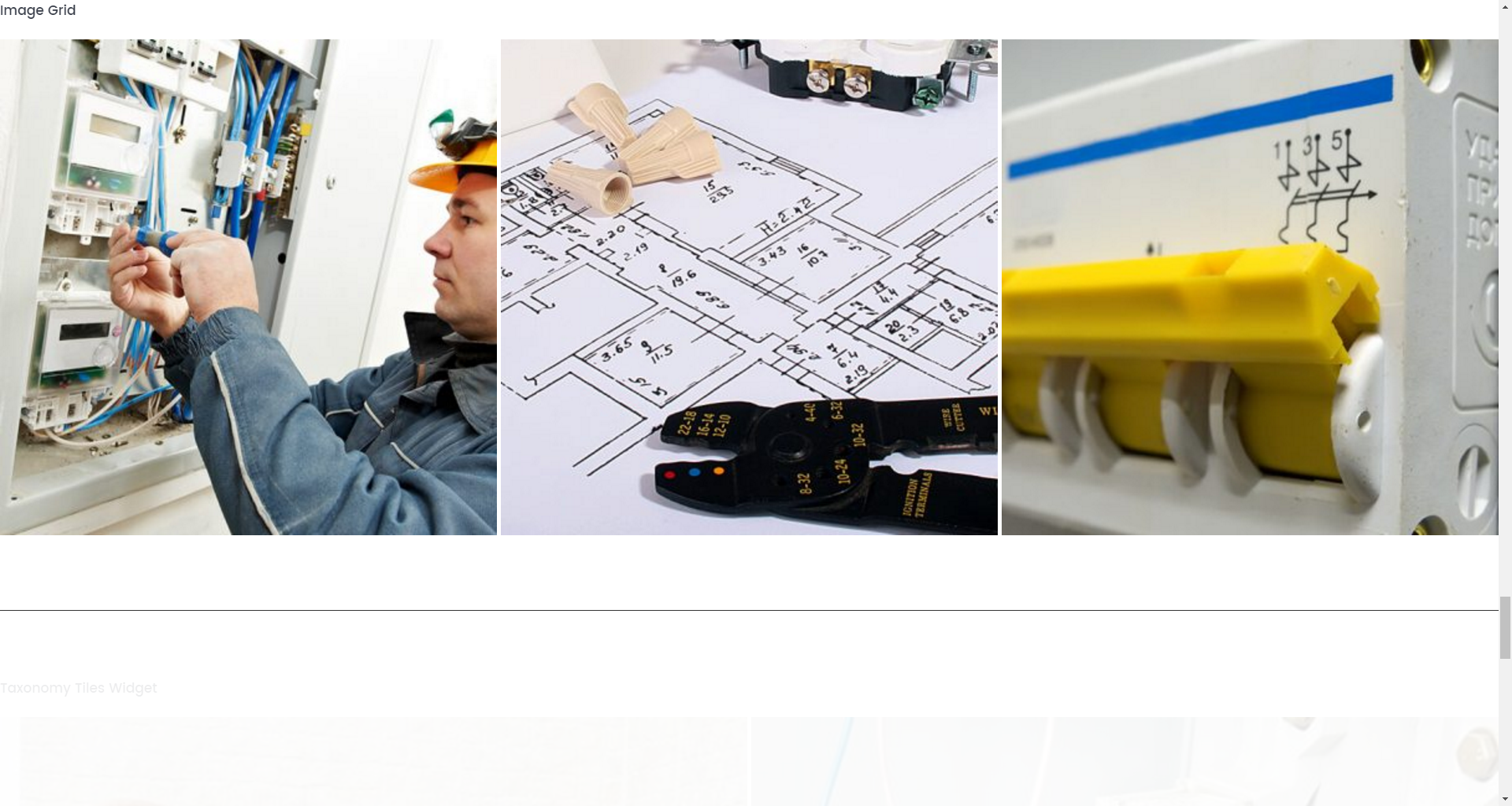
- Title - Widget’s text title
- Choose taxonomy type - Choose the posts source type
- Select cateogory / tag - Choose the posts source
- Post sorted - Choose the sort order
- Posts number - Limit the posts
- Offset post - Specify the offset
- Title words length - Specify post title length
- Columns number - Choose the number of columns
- Items padding - Choose the offset between items
Instagram widget
This widget is used to display a list of photos from Instagram network.
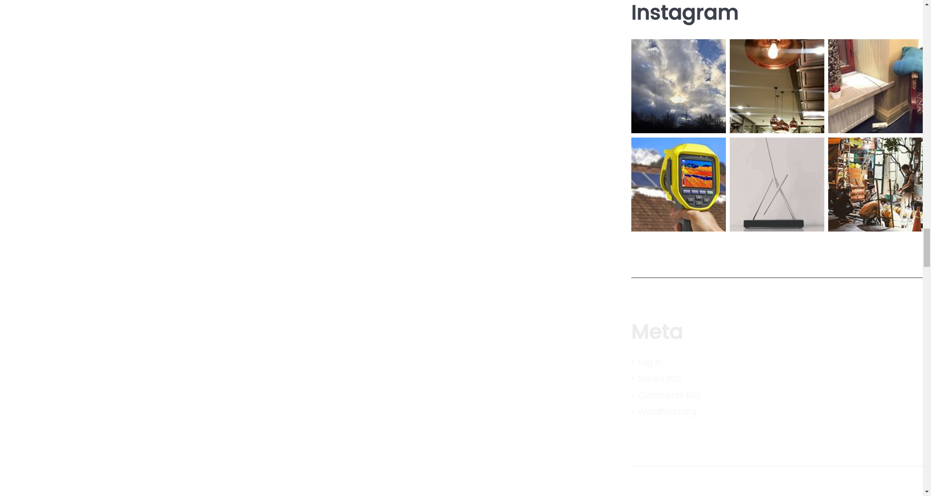
- Title - Widget’s text title
- Hashtag - Choose the hashtag
- Number of photos - Limit the photos
- Caption - Choose whether to show the caption of the photo
- Date - Choose whether to show the date of the photo
Meta widget
The widget is used to show 5 standard links..
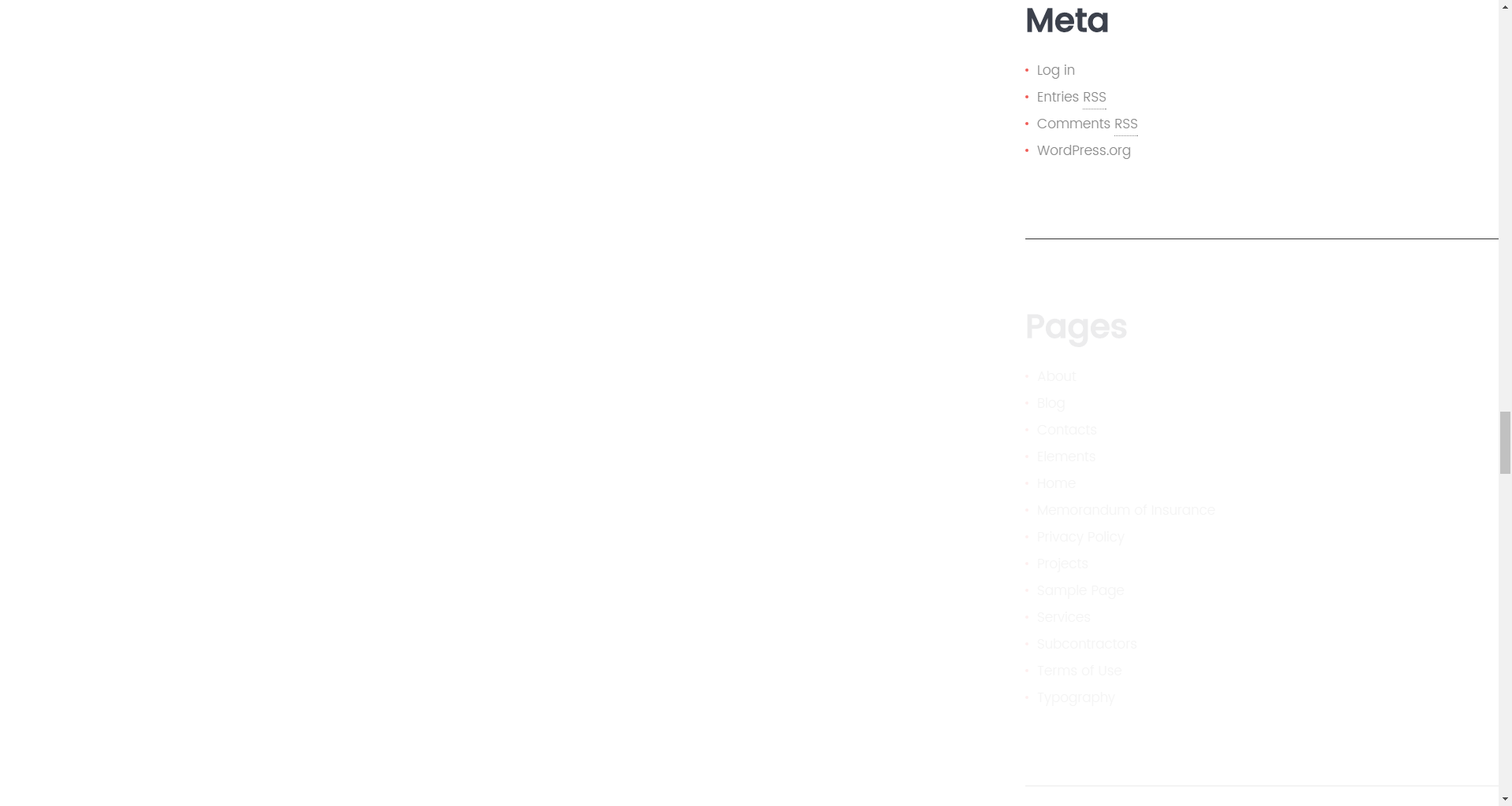
- Title - This property specifies the widget title
Custom Menu widget
This widget allows you to create various custom menus anywhere on your website..
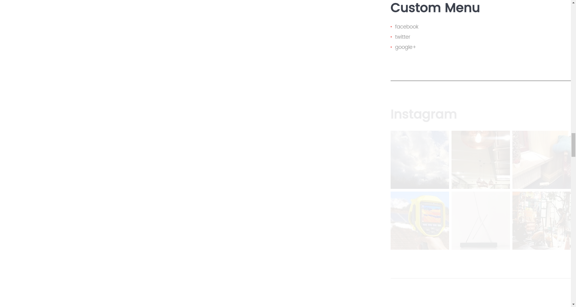
- Title - This property specifies the title of the widget
- Select menu - Here you can select any of the predesigned menus
Pages
This widget is used to display a list of your social networks
- Title - This property specifies the widget title
- Sort by - This option allows to sort the pages by page title, page order or page ID
- Exclude - Specify the IDs of the pages you want to exclude
Recent Comments widget
This widget is used to display the recent comments to the posts on the homepage.
- Title - This property specifies the widget title
- Number of comments to show - This property allows you to change the number of the displayed comments
Recent Posts widget
This widget is used to display recent posts on the homepage.

- Title - This property specifies the widget title
-
Number of comments to show - This property allows you to change the number of the displayed comments
- Display post excerpt? - Show/hide post exerpt
- Excerpt words length - This property specifies the excerpt words length
- Display post date? - Show/hide post date
- Display post thumbnail? - Show/hide post thumbnail
RSS widget
This widget is used to display information about your site.
- Enter the RSS feed URL here: - Specify the RSS feed URL
- Give the feed a title (optional): - Specify the title
- How many items would you like to display? - Specify the number of items displayed
- Display item content? - Show/hide item content
- Display item author if available? - Show/hide item author
- Display item date? - Show/hide item date
Search widget
This widget adds a search field to the page.
- Title - Specify the widget title
Smart Slider widget
This widget is used to display a smart slider.
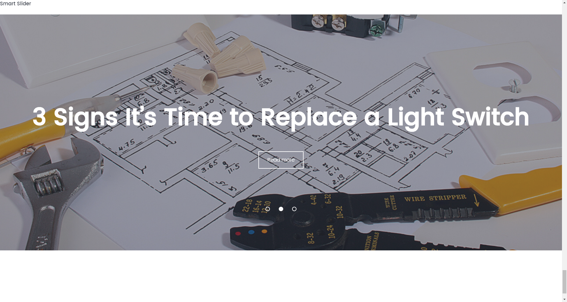
- Title - Widget’s text title
- Choose taxonomy type - Choose the posts source type
- Select cateogory / tag - Choose the posts source
- Posts Count - Limit the posts
- Display title - Choose whether to display post title
- Display content - Choose whether to display post content
- Display more button - Choose whether to display a more button
- Content words trimmed count - Limit the post content
- Mode - Choose the slider mode
- Slider width - Choose the width of the smart slider
- Slider height - Choose the height of the smart slider
- Slider orientation - Choose an orientation of the smart slider
- Slide distance - Customize the slide distance
- Slide duration - Customize the duration of the slide
- Use fade effect - Choose whether to use the fade effect animation
- Use navigation - Choose whether to show the navigation
- Slider Arrows Fade - Choose whether the arrows will fade in only on mouse over
- Use pagination - Choose whether to show the pagination
- Use autoplay - Toggle the autoplay
- Autoplay delay - Customize the delay of the autoplay
- Display fullscreen button - Choose whether to display the fullscreen button
- Shuffle - Toggle for slides to be shuffled
- Use infinite scrolling - Toggle the infinite scrolling
- Display thumbnails - Choose whether to display the thumbnails
Subscribe and Follow widget
This widget is used to display blocks of Subscribe and Follow sections. List of social networks for the Follow block is same as in Social Menu.
- Enable Subscribe Box - Enable/disable the subscribe box
- Subscribe Title - This property specifies the subscribe box title
- Subscribe text message - Here you can add text description for the subscribe form
- Subscribe input placeholder - This property specifies a placeholder text “Enter Your Email Here” in the input area of the Subscribe Box
- Subscribe submit label - This property specifies a placeholder text “Submit” in the subscribe button of the Subscribe Box
- Subscribe success - This property specifies a success message text “You are successfully subscribed” in the subscribe area of the Subscribe Box
- Enable Follow Box - Hide/Show Follow Box
- Follow Title - This property specifies the follow box title
- Follow text message - Here you can add text description for the Follow block
- Enable custom background - Toggle to enable the custom background
Tag Cloud widget
This widget adds a search field to the page.
- Title - Specify the widget title
- Taxonomy - Choose a proper taxonomy type
Taxonomy Tiles widget
This widget is used to display images from a taxonomy.
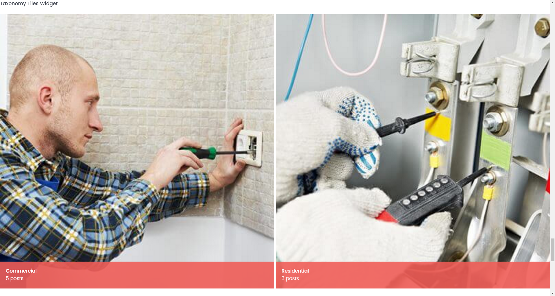
- Title - Widget’s text title
- Choose taxonomy type - Choose the posts source type
- Select cateogory / tag - Choose the posts source
- Description words length - Limit the description length
- Show post count - Toggle whether to show the post count
- Choose layout type - Switch between grid and tiles layouts
- Columns number - Choose a number of columns
- Items padding - Customize the padding between items
Text widget
This widget is used to display text information.
- Title - Widget’s text title
- Content - Add content to this field
- Automatically add paragraphs - Enable/disable paragraphs