Hardwire
Plugins
The plugins used in this template are described here.
Contact form 7
Contact Form 7 plugin can manage multiple contact forms. It also lets you customize the form and the mail contents flexibly with simple markup.
Displaying a Form
Let’s start with displaying a form on your page. First, open the 'Contact -> Contact Forms' menu in your WordPress administration panel.
You can manage multiple contact forms there.
Just after installing the Contact Form 7 plugin, you’ll see a default form - “Contact form 1″ and a code like this:
[contact-form-7 id="1234" title="Contact form 1"]
Copy this code. Then open ('Pages -> Edit') of the page where you wish to place the contact form. A popular practice is creating a page named 'Contact' for the contact form page. Paste the code you've copied into the contents of the page.
Now your contact form setup is complete. Your site visitors can now find the form and start submitting messages to you.
Next, let’s see how you can customize your form and mail content.
Customizing a Form
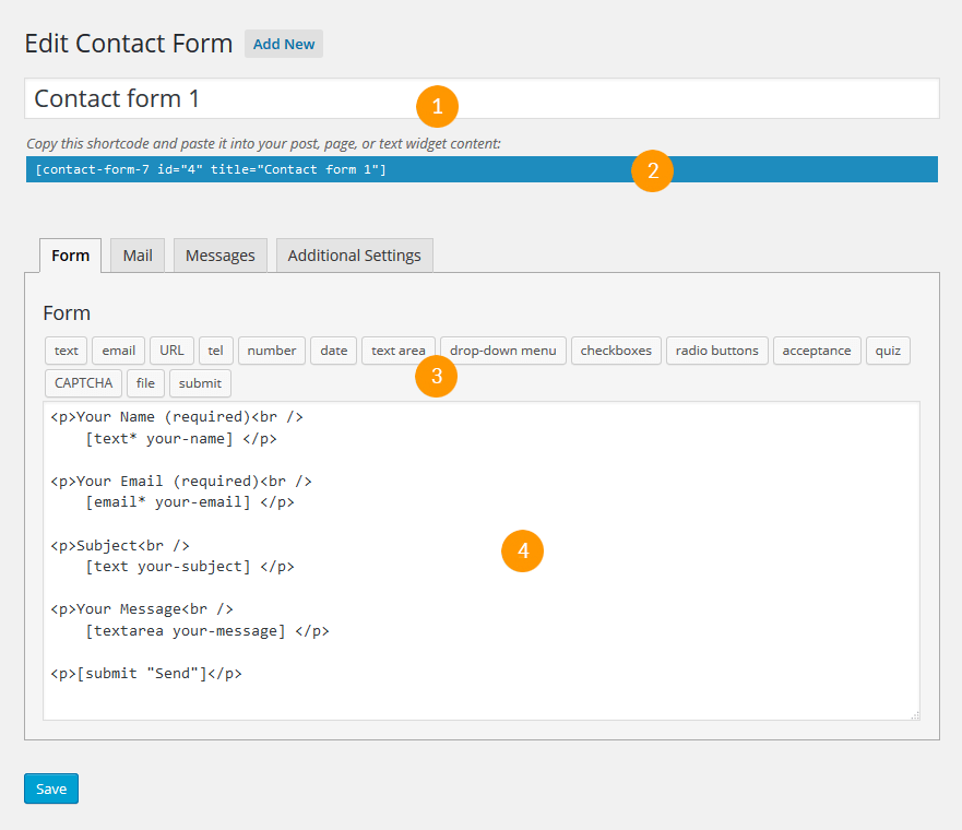
Title for this contact form is (1) which is just a label for a contact form and is used for administrative purposes only. You can use any title you like, e.g. “Job Application Form,” “Form for Event 2016/01/01″ and so on.
Shortcode for this contact form is(2). Copy this code and paste it into your post, page or text widget where you want to place this contact form.
Form Tab
Form editing the field (4). You can customize the form content here using HTML and form-tags. Line breaks and blank lines in this field are automatically formatted with <br/> and <p> HTML tags.
Tag generators (3). By using these tag generators, you can generate form-tags without knowledge of them.
For more information about form-tags, see How Tags Work.
Mail Tab
You can edit the mail template for the mail which is sent in response to a form submission. You can use mail-tags in these fields.
An additional mail template is also available. It is called Mail(2) and its content can differ from the primary Mail template.
For more information, see Setting Up Mail.
Messages Tab
You can edit various kinds of messages, including “Validation errors occurred,” “Please fill in the required field,” etc.
Make sure that only plain text is available here. HTML tags and entities are not allowed in the message fields.
Additional Settings Tab
You can add customization code snippets here. For more details, see Additional Settings.
Cherry Sidebars
Cherry Sidebars allows to create and manage your own dynamic sidebars.
Cherry Sidebars is a lightweight plugin for creating multiple widget areas, and outputting them on posts or pages of your choosing. Now you don't have to limit yourself to one widget area, instead you can create as many as you like. Group your widgets into multiple areas, and pick which one you want to display for a certain post or page.
The plugin can be useful for certain posts or pages, where you want your content to be different, for example you need to add a banner ad to your popular post, or a bio section to the 'About' page. Cherry Sidebars would be a perfect tool for this task.
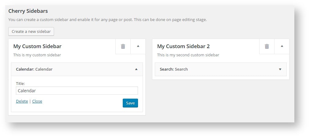
An example of two custom sidebars with the widgets.
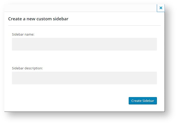
The form for creating a sidebar. Simply specify name and description for your new sidebar.
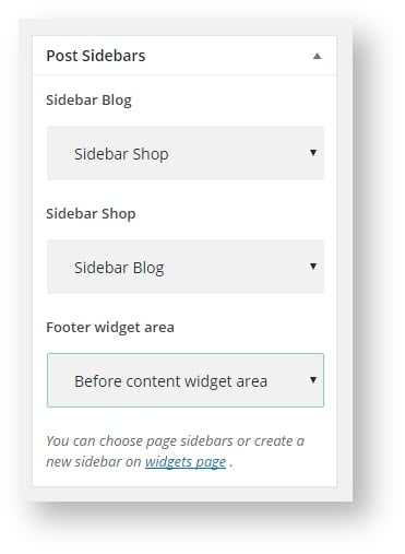
This is the sidebar manager panel that allows you to assign one of the sidebars to the current page.
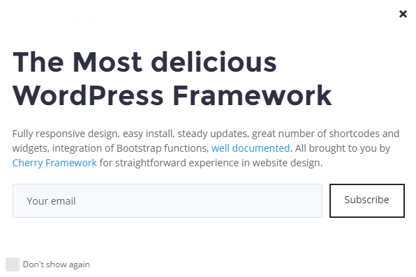
Cherry PopUps
This plugin is used to display popups of your projects on a site page. It has its own settings page which allows to save, reset and set default options. With its help you will be able to create various kinds of popups and manage them the way you like.
Popup Options
Each popup has its own settings which are gathered in Popup settings.
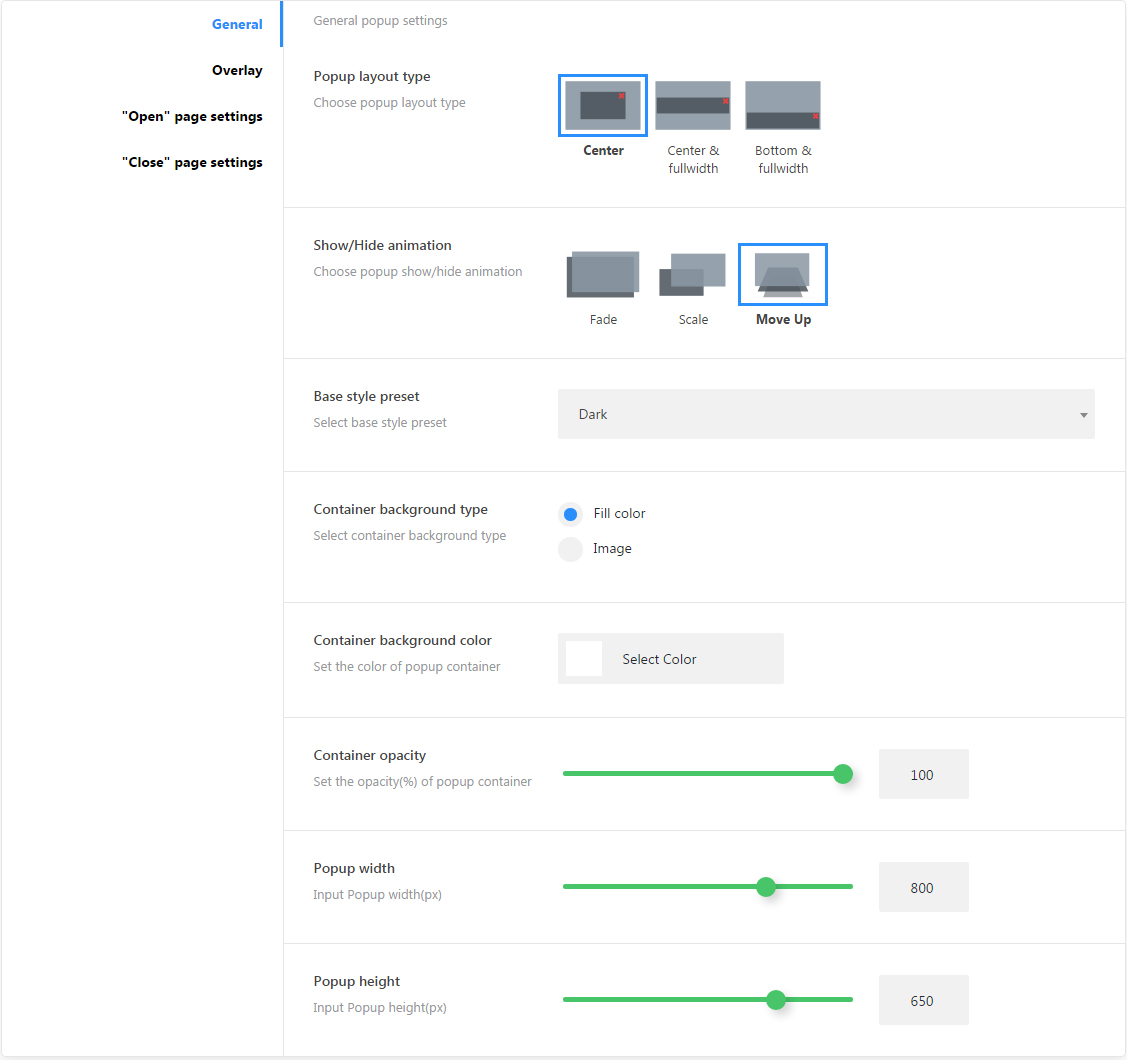
General Settings Sections
-
- Popup layout type
- Choose popup layout type (center, fullwidth center, fullwidth bottom)
-
- Show/Hide animation
- Choose show/hide animation effects(fade, scale, move up)
-
- Base style preset
- Popup controls base color styles(default, light, dark, blue, red)
-
- Container background type
- Container background type (fill-color, image)
-
- Container background color
- Popup container background color
-
- Container background image
- Choose container background image
-
- Container opacity
- Container opacity (active for fill-color type)
-
- Popup width
- Popup container width
-
- Popup height
- Popup container height
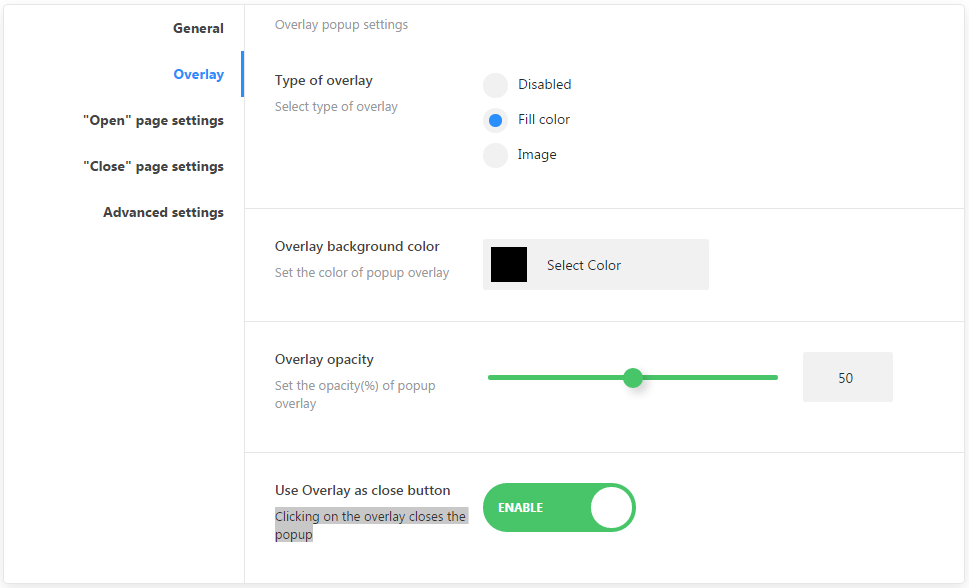
Overlay
-
- Type of overlay
-
- disabled
- Disable the overlay
-
- fill-color
- Background fill-cover
-
- Overlay background color
- Choose overlay background color
-
- Overlay opacity
- Set overlay background opacity
-
- Overlay background image
- Set overlay background image
-
- Use Overlay as close button
- Clicking on the overlay closes the popup
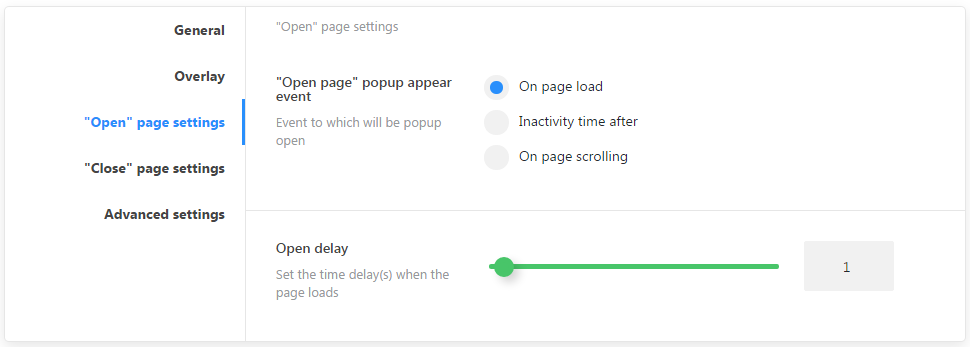
"Open" page settings
-
- "Open page" popup appear event
- Set an event to which a popup will be opened
-
- Close page popup display in
- Pages identification for the default popup
-
- On page load
- page complete load event
-
- Inactivity time after
- Inactivity time event
-
- On page scrolling
- Page scrolling progress event
-
- Open delay
- Set the time delay when the page loads
"Close" page settings
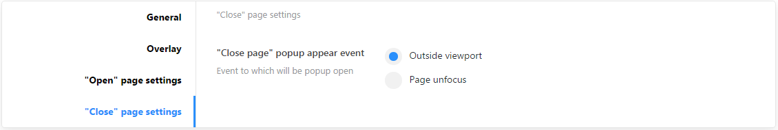
"Close page" popup appear event
-
- Outside viewport
- Set top border for mouse cursor
-
- Page unfocus
- User sets focus on another page or app in the system
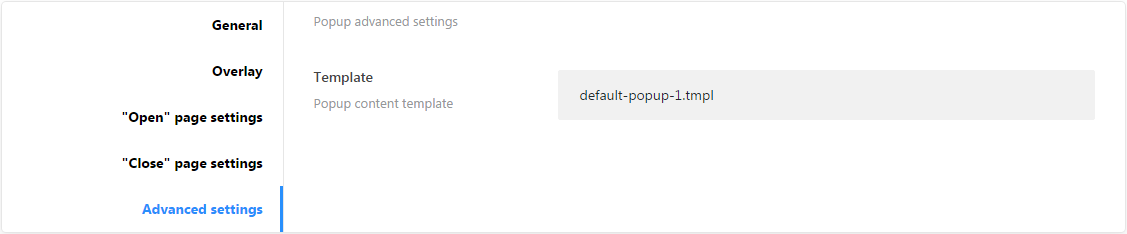
Advanced settings
-
- Template
- Template file for content
Popup Identification on static page
If standard settings are not enough for identifying a visible section, there is a metablock that allows you to add a particular popup to any static page. To find the metablock open any page of your website in the and scroll down to the Cherry Popups section.
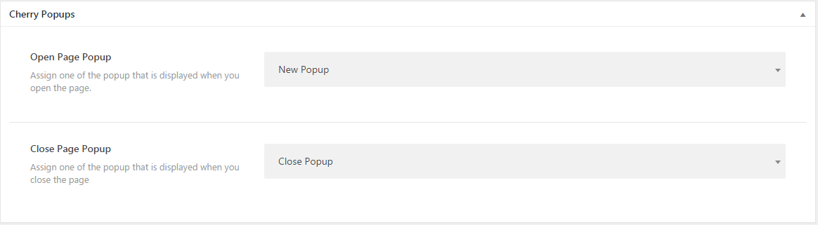
You can assign 2 popups simultaneously. One at the beginning, and another one at the end of section.
Plugin Options
All plugin settings are gathered in Popups > Settings
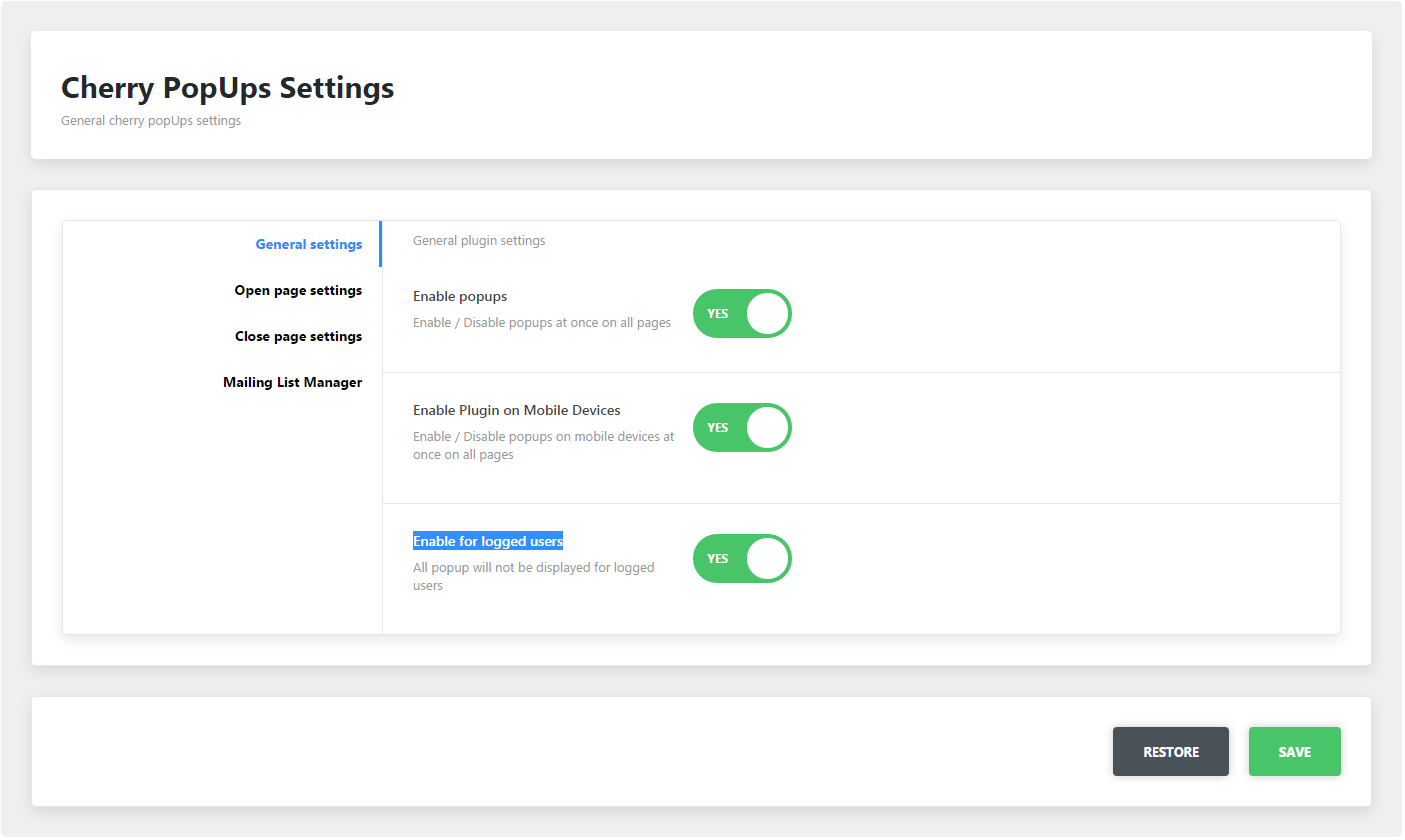
General Settings Sections
Here ou can define where and for which users to display popups.
-
- Enable popups
- Enable/disable plugin functions globally for the site
-
- Enable Plugin on Mobile Devices
- Show/hide popups on mobile devices
-
- Enable for logged users
- Show/hide popups for logged in users
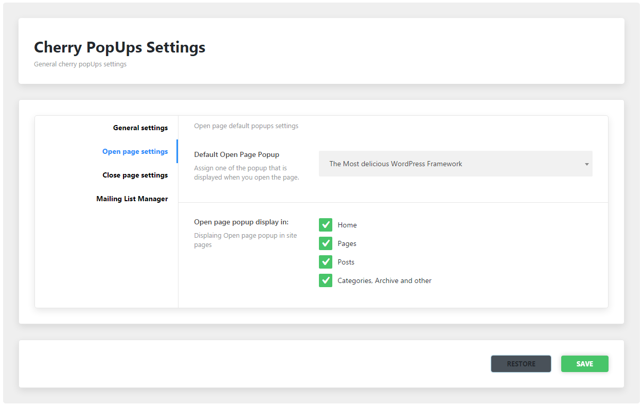
Open page Settings
-
- Default Open Page Popup
- Default open page popup identity
-
- Open page popup display in
- Pages identification for the default popup
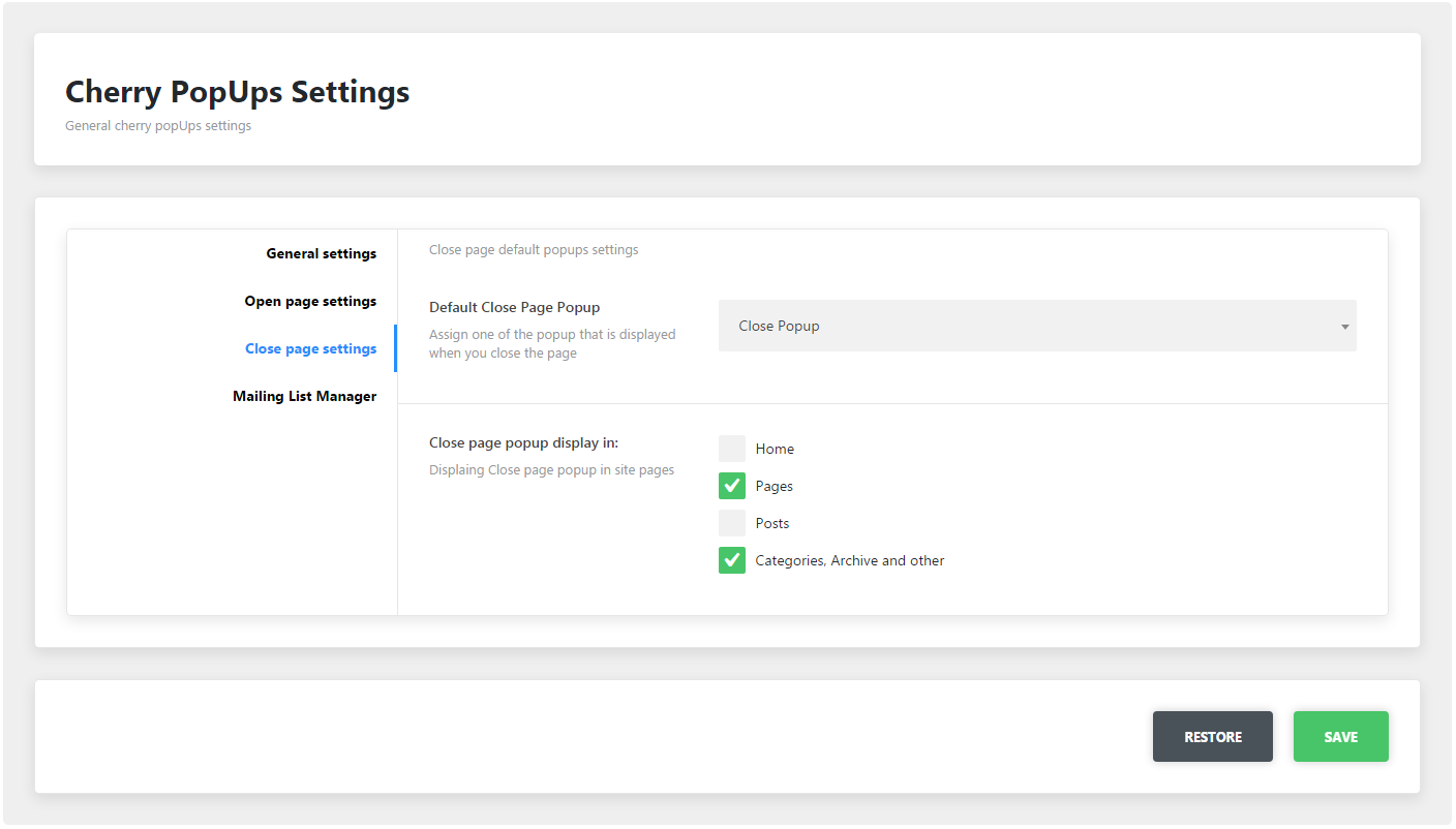
Close page settings
-
- Default Close Page Popup
- Default close page popup identity
-
- Close page popup display in
- Pages identification for the default popup
Mailing List Manager
MailChimp mailing list settings
-
- MailChimp API key
- Add MailChimp Api key (how to get)
-
- MailChimp list ID
- Profile list id (how to get)
TM WooCommerce Compare Wishlist
TM WooCommerce Compare Wishlist is designed as an addition to the TM WooCommerce Package and gives your store even more functionality. With its help visitors will be able to add various kinds of products to the wishlist and compare pages. The plugin actually combines two separate widgets and installs them with a single click of a mouse.
TM WoooCommerce Package
This custom designed plugin from TemplateMonster. It brings a set of widgets that will help you make the site work to the full potential.
-
- About Store widget
-
- Banners Grid widget
-
- Custom Menu widget
-
- Product Categories widget
-
- Products Carousel widget
-
- Products Smart Box widget